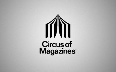
Circus tent looks like a magazine.
Backspace
Just looking at the logo makes you want to press "backspace" and correct the typo.

Barcode
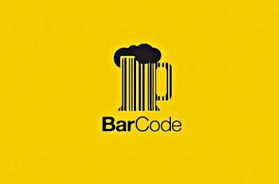
Notice that the word "bar" is darker.
To beat or not to beat?

The question mark is made of a belt.
Bird

Letter "B" is also a bird.
Cafe Click
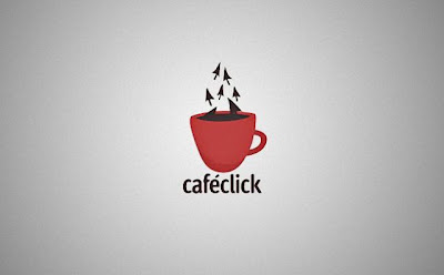
Coffee steam is made of mouse pointers.
Amazon
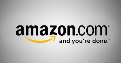
The arrow from A to Z, symbolizes what Amazon is known for selling everything from "a to z" . It also serves as a smile, making the company feel friendly and approachable.
City Direct
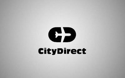
"Notice how the space around the plane forms the letters C and D." (Tobias)
Elefont

There’s an elephant trunk inside the letter "e".
Formula 1

Empty space in the middle creates a number "1" for "Formula 1"
Families

Those 3 letters in the middle 'i', 'l', and second ‘i’ represent a family
F*ck!

A bit provocative logo against nazism and racism.
FedEx

If you look closer you’ll notice the right-pointing arrow in between the ‘E’ and the ‘x’, representing precision and speed at which FedEx works.
Iron Duck

A hanger looks like a duck.
Yoga Australia
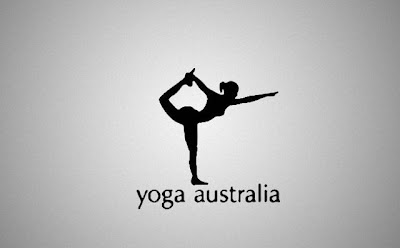
Woman is making a pose that forms the Australian continent between her leg and her arm.
Killed Productions

Letter "i" is lying as if it was killed.
Mr.Cutts

The scissors are transformed to look like a face with glasses and mustache.
NBC

There's a hidden peacock looking to the right representing the company’s motto to look forward, and not back.
Pencil

Letters "i" and "l" form a pencil.
Shocked
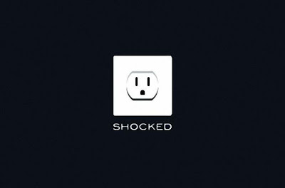
The socket’s expression says it all.
Sushi

Letter "H" looks like chopsticks picking a sushi.
Twins

Letter "N" looks like number 2, symbolizing twins
Wine Searcher

It looks like eyeglasses binoculars and bottles of wine at the same time.
Half

Mosleep
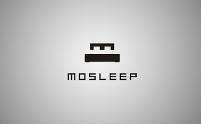
Mosleep is an organization of doctors that deals with people having sleeping disorders. The logo is their intial 'M' that was designed to also look like a bed.
Push The Bottle

You can see a hand pushing a button inside the bottle.
Threesome

Up

An arrow showing up forms a letter "u" and also has a hidden "p" inside.
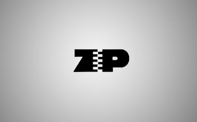
Zip
Bipolar

Leave a Reply
New Visitor? Like what you read? Then please subscribe to Beautiful Photography Feed or sign up for Free Email Updates in your Inbox. Thanks for Visiting!